Here’s a follow up to a post I published a few years back, where I took a look at historical financial charts and various investment markets. Since it’s been a while, I’ve decided to do an update on the performance of different markets. Note that the charts illustrated below reflect a snapshot in time, primarily up to the end of 2009.
What can we learn from the historical behavior of asset classes and global financial markets? Being a good investor requires regular monitoring of our high interest savings accounts and online brokerage accounts to gauge just how our investments are doing over time. One thing you may want to do is to make sure that at the very least, your investments are matching market returns. For example, if you’ve got Japanese stocks in your portfolio, you’ll want them to perform at least as well as their underlying asset class, represented by the Nikkei index.
When you create your asset allocation model, it’s wise to start with getting the big picture on the various asset classes that will be represented in your diversified portfolio. So I did some research to take a snapshot of the various historical charts that measure these various asset categories. How have these categories and markets been faring over time? How well have they contributed to the returns you’ve been experiencing of late, and can you spot which ones could possibly be overvalued or undervalued?
A Look At Global Financial Markets, Historical Charts & Investment Performance
Following are some long term historical charts: For each of these images, you can click on each picture for a larger version. I also specify how each chart has been sourced.
Historical U.S. Stock Market Charts
Let’s take a look at how the U.S. stock market has been doing by checking out the Dow Jones Industrial Average chart. Here’s how it has performed over the last 110 years (1900 – 2009, Monthly):
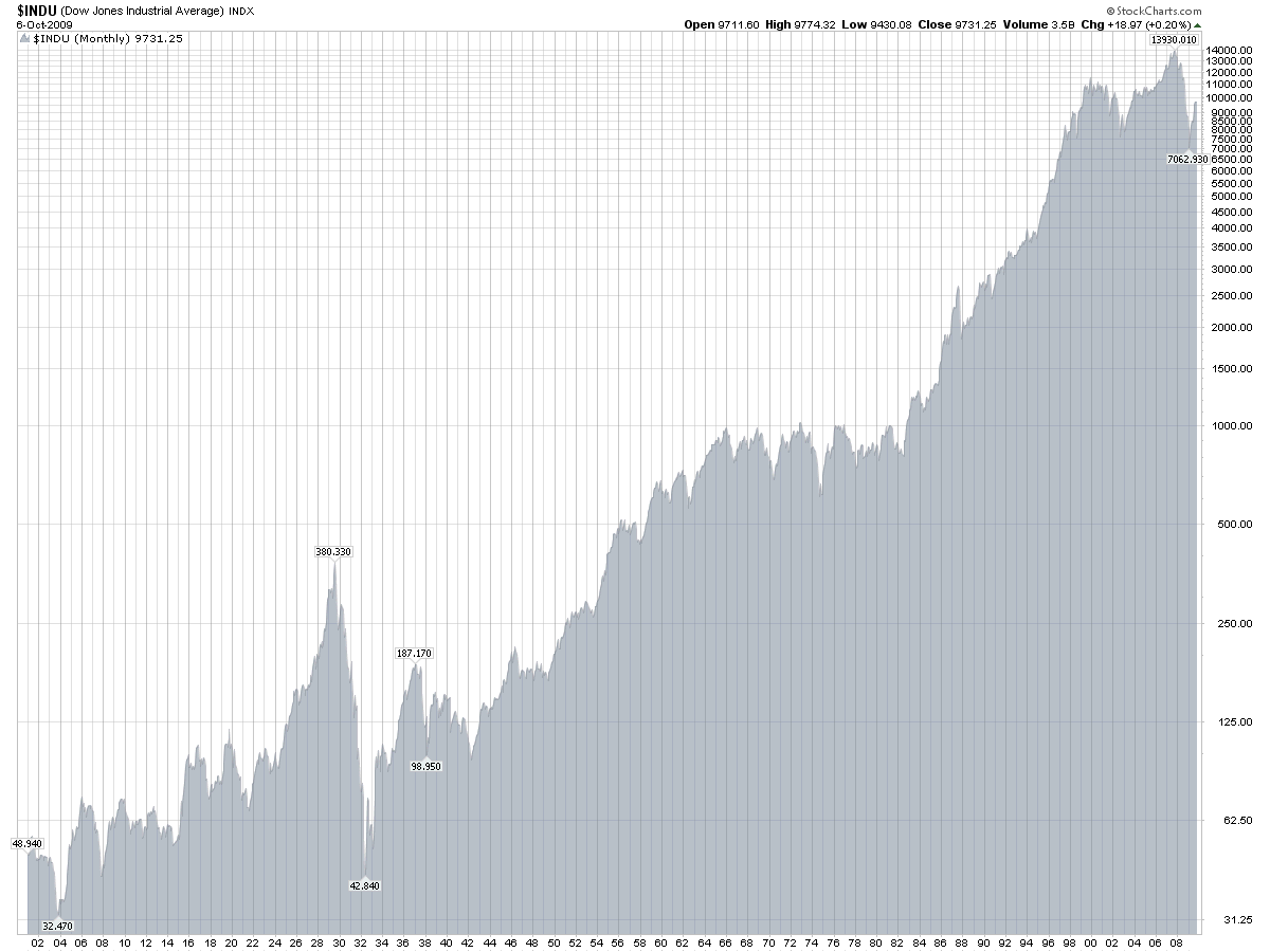
Source: StockCharts.com
Here’s another DJIA chart that I found interesting. It maps out both bull and bear markets as seen through history (again, from 1900 through 2009). The red sections are marked as bear markets.
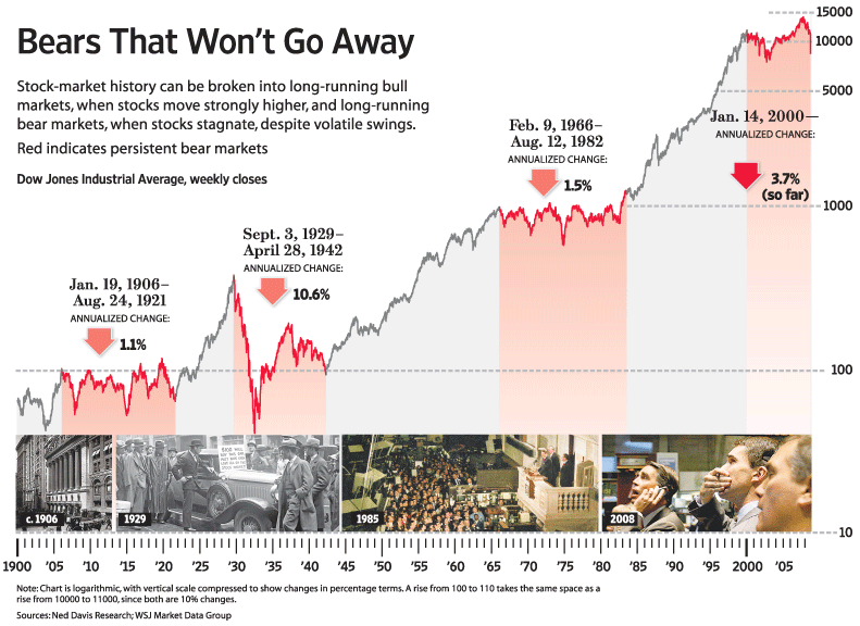
Source: Wall Street Journal
For other long term charts of U.S. indexes, check out the S & P Weekly Chart (1960 to Present) and the Nasdaq Weekly Chart (1978 to Present).
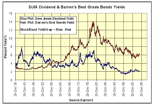
Historical Charts For U.S. Bonds
When reviewing U.S. bond charts, you’ll notice how bond prices are inversely proportional to bond yields, which means that they move in opposite directions. When bond prices go up, bond yields and interest rates go down, which you’ll notice in chart patterns.
Bond Yields Chart, Yearly (1938-2008)
30 Year Treasury Bond Prices (1978 – 2009, Monthly)
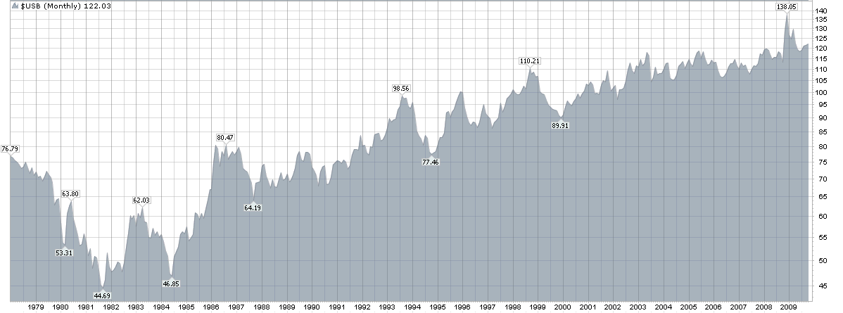
Source: StockCharts.com, the bond yield chart is plotted in red.
Historical Chart For Gold Prices, Yearly (1975 – 2009)
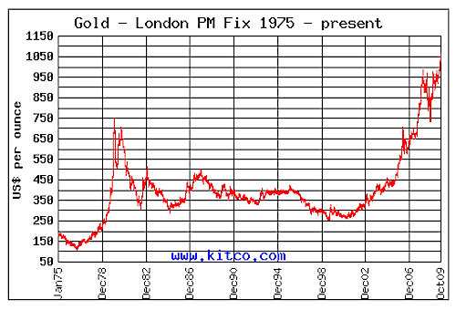
Source: Kitco.com
Gold prices were flat for quite a long time after peaking in the early 80’s. But it appears that this asset class is seeing some better times, with current rallies taking it over $1,000 an ounce. Historically, gold does well when there is economic uncertainty and widespread worry in the financial markets, so it’s no surprise it’s doing so well right now as a “safe haven” for nervous investors. It’s always a good idea to diversify your investment portfolio with precious metals such as gold, in order to neutralize the effects of lower equity prices during an economic downtrend.
Historical Chart For U.S. Real Estate, Yearly (1970 – 2009)
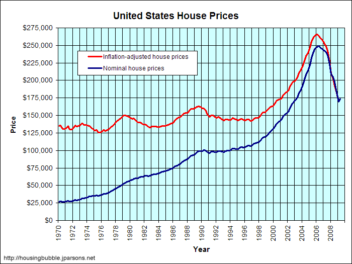
The huge runup in real estate from the late 90’s to the mid 00’s has since been reversed to some degree. Housing prices today are more in line with what they were in the early 00’s. While foreclosures still abound around the nation, it seems that in many places, real estate prices have stabilized. But it remains to be seen what kind of returns this market will be yielding in the future. I doubt we’ll see again, the kind of unprecedented price increases in real estate that we experienced over the last decade. Will we learn anything from having gone through this housing bubble?
Historical Chart For The Nikkei Index, Yearly (1970 – 2009)
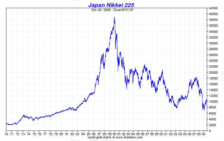
Source: Sharelynx.com
If you want to see the most frightening market chart of all, then look no further than the historical chart for the Japanese Nikkei index. The performance of the Japanese market should serve as a lesson to all investors that not all markets reward us with a long term upward trend. The serious excesses in the late 80’s have done a lot of damage to the Japanese economic system and to this day, their stock prices have never returned to the heights experienced two decades ago.
Historical Chart For The China Shanghai Composite Index, Yearly (1991 – 2009)
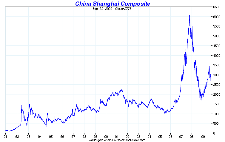
Source: Sharelynx.com
It wasn’t just the U.S. stock market that deflated late last year — so did the Chinese stock market, as represented by the Shanghai Composite Index. But as you can see, its tremendous, meteoric rise in 2007 just did not seem sustainable. At this time, I see equity prices meandering at more reasonable levels, albeit having recovered along with the U.S. market indexes.
Here are additional observations I’ve made on the recent behavior of various investment markets such as the U.S. housing, U.S. stock and international equity markets: there appears to be a noticeable correlation between them as far as how prices have trended over the past few years. This goes to show us that certain markets may be much more in lock step than we may think. It’s important, therefore, to keep our portfolios well diversified in order to accommodate many asset classes, particularly less correlated ones (such as equity vs gold vs commodities). This will actually help us manage our investment risks better.
Copyright © 2010 The Digerati Life. All Rights Reserved.

{ 13 comments… read them below or add one }
Love the graphs….stock market…long term…has been steadily climbing….over the 90 year span the recession looks non eventful…I guess that’s why we only invest for LONG TERM…not market timing. Good job.
guess that’s why we only invest for LONG TERM…not market timing. Good job.
I am inclined to value investing and when my pockets get deeper, I want to diversify into global markets because at the moment i am following pro investors advice to stay only with “local” investments.
Didn’t realize things were that bad with Japan’s market. People are complaining in the U.S. about a 0% return over the last ten years but Japan has had it a lot worse.
It’s important, therefore, to keep our portfolios well diversified in order to accommodate many asset classes, particularly less correlated ones (such as equity vs gold vs commodities).
And cash! People always forget cash!
Actually, people don’t always forget cash. People forget cash at times of runaway bull markets. When stocks are going up so fast, cash seems dumb. But those are just the times when cash is smart! Cash gives you a way to hold onto your assets when all other investment classes are priced to provide negative returns. That’s an awesome deal. When the other asset classes drop to fair value, you can then use the cash to buy those other asset classes.
Each asset class serves a distinct purpose. Stocks are my personal favorite. I just wish that more people could see that loving stocks does not mean hating cash. These two are complementary asset classes. I love cash because I love stocks. It’s by investing in cash when stocks are overvalued that I can come over time to own more stocks.
Rob
Interesting graph, but personally I think the dynamics of investing has really changed in the last 15 years. With the internet you not only have more information at your fingertips but you also have so many more investors who trade with discount brokerage accounts.
20 years ago you could not go onto ETRADE and make a trade during your lunch hour. Chances where that you did monitor stock prices through your newspaper each day, unless you were a serious investor.
I think we will see more ups and down as we have in the last 10 years, rather than a long upward trend. Too many factors in the market make fundamental information less important day to day.
Hi all!
Love the charts! Studying charts and learning when to stay with funds and get out is so important. I’ve studied several different ways to do this and believe that staying with a fund as long as its six month return is among the leaders is key to not switching too often and building a very nice portfolio over 20-30 years; I looked at returns for several years in the early 90’s as well as the 00’s. Just picking and staying with one fund may offer great returns but also expose one to great risk.
Wow, I didnt realize that the stock market backfired that much after the boom of 1929. I see there the small retraction, which lasted for a few months when they were temporarily bailed out.
I can now see how what I have heard of how excited everyone was about making money durring the twenties. However, obviously the smart investors realized the error in thinking.
Apparently, the main concept of this post is to keep your investments in line with what the banks are offering.
Banks have not been offering much and the max guaranteed ROI is about 3 percent. This is fine for very safe investing. But, what about those investors who want to make more ROI. It is definitely possible. However, not guaranteed.
What about these investors?
One more thing that came to mind, what about inflation? The returns that banks give you dont even keep up with inflation.
I help people invest money if they choose not to take a structured insurance settlement. One thing that can be hard to convey is why financial diversity is so important. These charts help tell the story. I think even a non-sophisticated investor can understand the historical trends with these charts. Thanks for the great info.
I find it very interesting that the price of gold has skyrocketed since 2002. At what point does this hit its peak and do you believe it is overvalued?
Gold may peak by 2012, JAN 10.
Great collection of charts.
The most important concept I think is to understand that like the house in Vegas, the odds are stacked in the favor of the rich and well-connected.
BUT, the odds are much better in financial markets. The key is getting on the inside. You’ll make so much more money, particularly in highly volitile times for investing.
I like the historic data.It shows that each bubble has its burst and I expect to have a gold burst and a double dip though not in correlation.