I’m somewhat of a chart freak, but not as sophisticated as those who’ve gotten into the chart reading business of stock market technical analysis. What I do enjoy are the visual diagrams that give us the big picture from a chaotic bunch of financial data, giving us the low down in one glance.
I like how simple charts can give you a quick low down of what’s transpired throughout the years (or even decades). If you’re a long term investor, you may be able to appreciate the full view of how money has been minted throughout time. A stock market graph can easily remind us of just how much risk there actually is when you entrust your money to the markets. These charts show us those times when greed or fear take over — and also make us appreciate those periods when there’s at least, some level of stability (which hardly lasts too long). On the other hand, technical analysts and traders enjoy these charts as these form the foundation of their work. They ride the markets like any cowboy does a bull, and either make a ton or lose a shirt. It’s all part of the game.
But enough of my musings. I’ve collected some interesting charts that represent how money has behaved for us in the last several decades and which tell us stories of prosperity between bouts of volatility, as marked throughout history. I picked up these charts from various sources (with permission), which I’ve pointed out at the end of this post. Note that I am not a technical expert of the markets by any means, so please feel free to correct, clarify or further discuss any notions I’ve presented here.
Click on each picture for an enlarged version.
U.S. Stock Market Charts
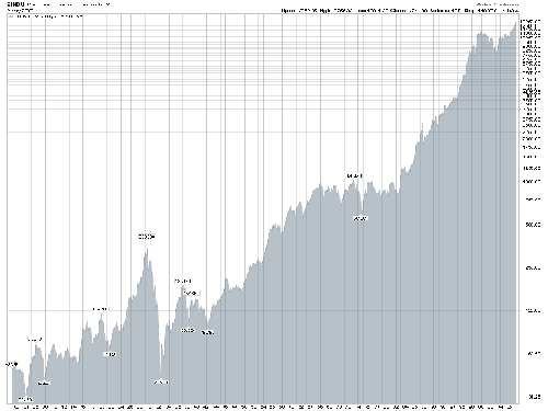
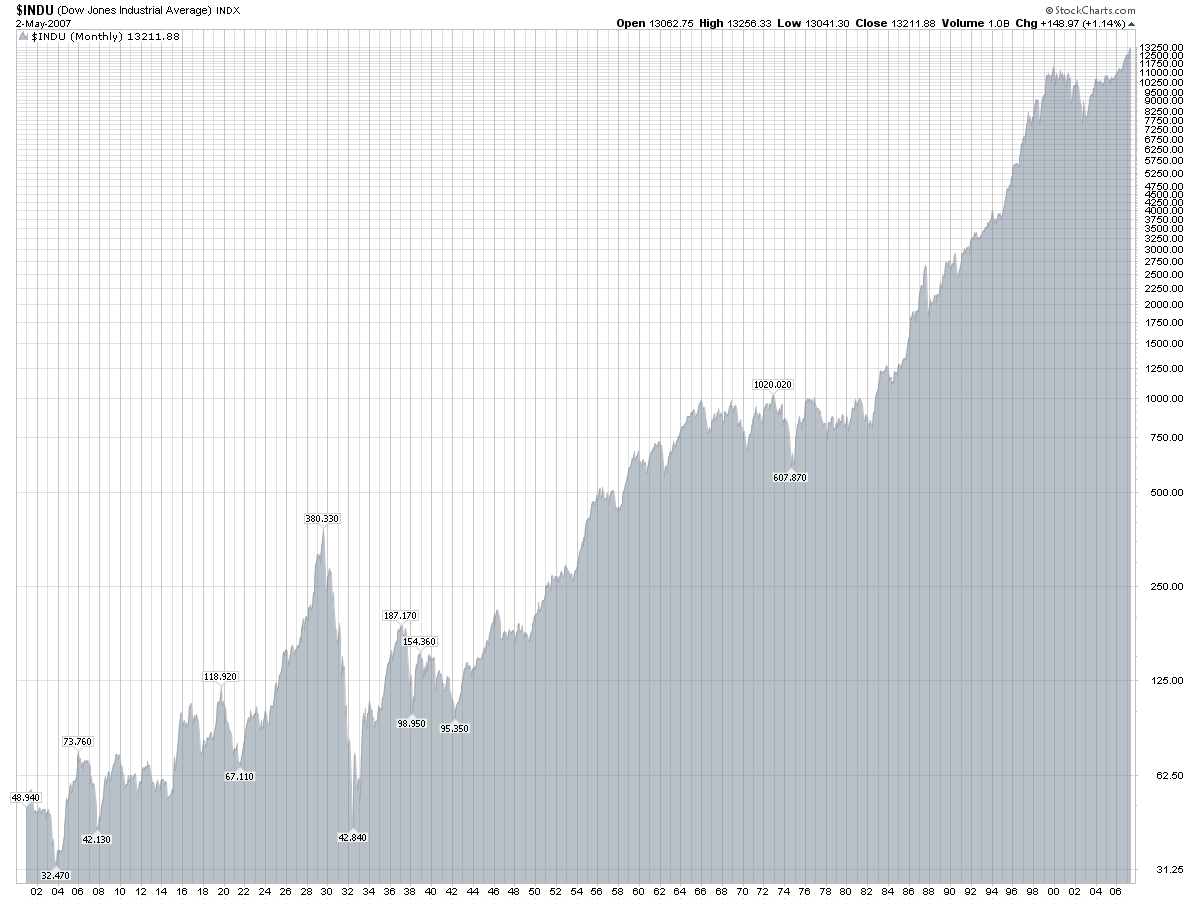
Representing the United States Market, this is how the Dow Jones Industrial Average has performed in the last 107 years (1900 – 2006, Monthly):
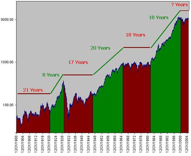
Here’s another look at the DJIA in the last 105 years (1900 – 2005):
|
This image is from The Big Picture, where they fashioned the chart to show differing market activity in color: Green for bullish periods and Red for bearish times.
These are additional charts for the other US market indices: S & P (1960 – 2006 Weekly Chart), Nasdaq (1978 – 2006 Weekly Chart).
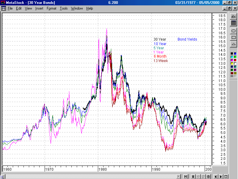
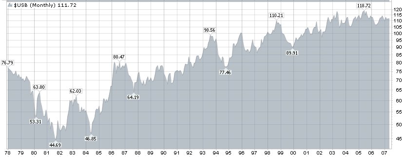
U.S. Bonds, Historical Charts
Bond Yields Chart, Yearly (1960 – 2000)
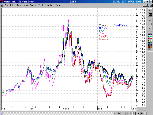
30 Year Treasury Bond Prices, Monthly (1978 – 2007)
It may be a little trickier to see the details on these bond charts, but I encourage you to click on the images for clearer display. What’s interesting here is that it shows how bond prices behave with respect to bond yields throughout the years: they move in opposite directions. As bond yields and interest rates go up, the bond prices move down. And in this case, you see the marked opposing behavior with these patterns throughout the 1980’s. Bond yields peaked while bond prices slumped along the same time. If you invert the bond price chart, you can see how closely it looks like the bond yield chart in reverse.
Gold Prices, Yearly (1975 – 2007)
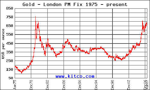
Gold peaked sometime in 1980 and plummeted in the years after. Now it seems to have recovered nicely, but what could be in store for it? For closer looks at gold’s historical prices, you can check the 30 year span here, or one covering 1980 – 2006 (monthly).
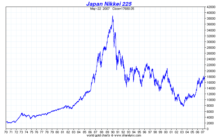
Nikkei Index (Japan Stock Market), Yearly (1970 – 2007)
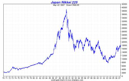
In my mind, this is the scariest chart from the macroeconomic sense. It has bucked long term growth trends by moving downwards and shows that even a large market can plateau indefinitely. The last 7 years shows how much Japan tracked the U.S. equity market. Looking back the previous 30 years, they’re very different animals.
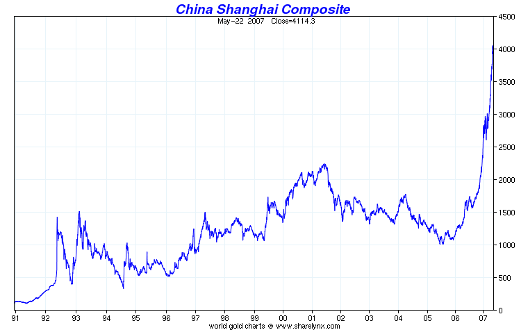
China Shanghai Composite, Yearly (1991 – 2007)
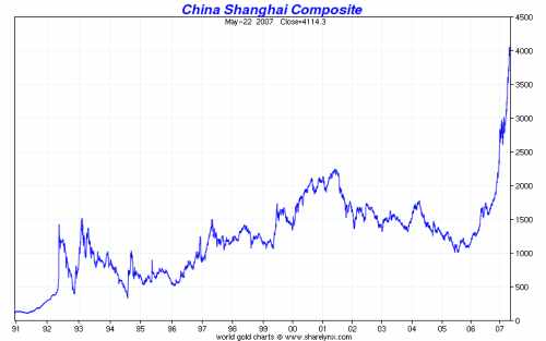
Though the Shanghai Exchange has been around for over a century, it has only existed in its present form since the end of 1990. Looking at it, it looks crazier than the irrationally exuberant U.S. dot com boom. We all know of course what happens to a wild boom like this in the course of a few years. Let’s see how it does in the near future. With China’s hot economy, hungry consumers and strong demand for everything, how long will this market defy normal market behaviors and valuations? Some of you may argue that this is what “scary” looks like. More on the Shanghai Stock Exchange here.
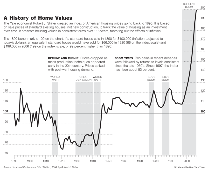
U.S. Real Estate Historical Prices (1890 – 2007)
This historical housing chart has been making the rounds of the net. I have seen it at BiggerPockets.com and GetRichSlowly.org.
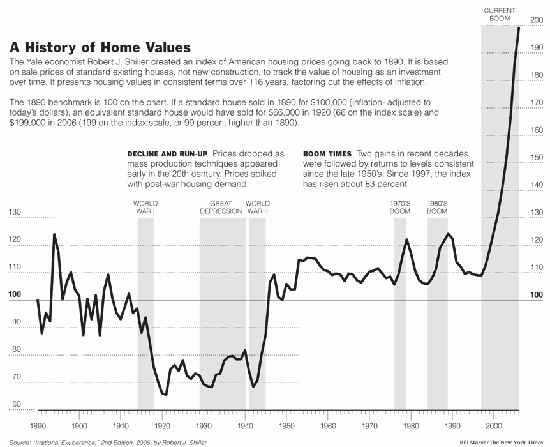
Here’s why so many people have gotten rich — by means of owning their own home. But this looks like it’s ripe for a change; in fact, the shifts are already occurring, with regular news of foreclosures, subprime mortgages gone sour and sluggish sales. Want to know what it feels like to ride this roller coaster? Then hop on board! One more thing, is it just my eyes or does the Chinese stock market look similar to the U.S. property market?
I just showed you the long term price and performance charts that have spanned decades and which represent developed and developing equity markets as well as bond, commodities and property markets.
What do these pictures tell us? As expected, it appears that the U.S.’ developed markets have been the most well behaved in terms of being the most upwardly predictable and the least choppy. I’ll say this is the reason why most of my bucks are still in the U.S. And except for the case of Japan (and arguably, gold), all other markets have moved up in the LONG term. Still, there’s a lot of volatility along the way with periods of boom and bust that would’ve caught you off guard if you didn’t have a plan. If you decide to pull out of the markets at a time when you HAVE to, such as when life circumstances dictate, you face the risk of selling at the wrong moment. This is the reason why conventional investment advice tells us to sit tight for the long term and keep our money in the market in a diversified fashion. With proper asset allocation across all these markets, your diversification strategies will help reduce your risk while you ride your investments to higher ground as time goes on.
Image credits go to these great sources for financial charts (thanks to Nick Laird, et al): Sharelynx.com, ChartsRUs.com, GoldMarketData.com, StockCharts.com, Kitco.com (Kitco Bullion Dealers).
Copyright © 2007 The Digerati Life. All Rights Reserved.

{ 17 comments… read them below or add one }
Great reference. I think this is a great reminder about how we should put things into perspective, as investors. I agree that long term investing is the way to go.
SVB,
I am a little skeptical about the housing chart. It shows no gain from 1960 to 2000. That doesn’t seem to match with the growth in housing prices during those years.
On the Dow chart, it really is a stock pickers market nowadays. No more trend that raises all stocks. Probably a good time to buy good stocks and hold for twenty years:-)
Super Saver,
The blurb on the housing chart image when you click on it says that the chart is an index that factored out the effects of inflation. Here’s the accompanying explanation for the graph:
“The 1890 benchmark is 100 on the chart. If a standard house sold in 1890 for $100,000 (inflation adjusted to today’s dollars), an equivalent standard house would have sold for $66,000 in 1920 (66 on the index scale) and $199,000 in 2006 (199 on the index scale, or 99 percent higher than 1890).”
Taking out inflation, it shows you how sale prices of existing homes (not new development) have risen in value, thanks to many factors such as supply/demand and in recent times, speculation. Guess that’s why the chart flatlined from 1960 to 2000.
http://www.thedigeratilife.com/images/homepricesL.gif
Hello SVB,
Today I found your page as we are both members of IBN. And immediately became your reader. Especially this article about charting I like very much.
Thank you for that work,
Hi Vld2czech,
Thanks for the kind words :). I’ll be checking out your site as well! I agree that it’s nice to see all the historical charts laid out in one discussion.
Studying the dow chart. The 17 years of down markets (red) is really only around 3 years. If you look at it from 1932 it would all green. It is like the techs of 2000. We had the big up until 2000 and then a violent crash. Starting in 2003 it would be green again. It is all perspective. ie buy at the violent bottoms. Which the overseas one is upon us.
Great post. I’ve actually considered doing a similar one, but I don’t think it would have been as ambitious. Thanks for referencing our post on Irrational Exhuberance, btw!
Nice charts especially for today (mar 2009)!
Would be nice to see the chart against some earnings measure
Wow, this is a lot of information to take in, I’ll have to look at it a little more, but from what I’ve actually studied this stuff is pretty awesome. I love seeing patterns in the historic bumps in the economic timeline. Makes me feel like everything will turn out ok despite all the craziness that is happening now.
So… it’s still holding truth! Well I believe as well and here is why… I have followed every book by Harry S. Dent Jr. and his last one is scary! I was looking for the ecomony of Japan as a reference to find any understanding and I DID! I wish i had the next graph but it you were to show the birth rates of Japan against their stock market, one would also find a similar path to the U.S. markets. What I am suggesting is that we have the largerst population ever, that is now or once making great money, spending much of it in our economy! Now, with the stock market down, and the economy unsure, less spending! so with the much smaller population that is behind.. growing older…in a much smaller group.. we have lost our strength! Furthermore, we have those same seniors on social benefits from the U.S.! Don’t get me wrong. I AM AN AMERICAN! Just trying to call a spade a spade! Last thought is when you look at Japan… They are ahead of us and over the last ten years went through what I am talking about….. LOOK at what they have gone thru? I f you have a Mutual Fund there then you know already! Hey… I am just a guy with opinions, but they seem to add up with traction…..
Thanks! CB
I was just looking at long term Nikkei index charts and how they may relate to the US stock market today (late March 2010).
It does look like we are going to follow a related pattern. I would see the Dow range bound 7000-11000 until the end of the decade (2020) if not longer. We may likely test the 7000 level before year end. I expect a short term top within the next week.
I’m planning to post a follow up of this post on the blog soon. Thanks for the comment Andy! 7,000 seems like a big stretch down. I wonder if it can ever get there again…. but we’ll see!
there may be support around 9000 — we need to see what the europeans do (or don’t)…
Funny, I said it first…
Gold is expected to skyrocket soon, what impact do you think this will have on housing prices?
I’m coming to the game way late, but I like the work you did analyzing the information and giving us the gist of what’s going on. Real estate is slowly working it’s way back to more stable ground as the economy recovers. Nice charts!
“Gold is expected to skyrocket soon, what impact do you think this will have on housing prices?”
mild impact probably because gold is over inflated right now anyway.