Every so often, The Digerati Life goes through a few changes to address improvements that our readers have been asking for. It’s been a while since we did a major overhaul here so it was time to get a new look in and I hope you like it! So today, I will be sharing with you a little of our design history and theme changes. 🙂
While working on the new design, I couldn’t help but think of what a long and fun road it’s been running The Digerati Life. The personal finance blogosphere has evolved since I started down this path, with many bloggers coming and going, but I’ve always appreciated just how diverse, yet organized, this little corner of the web was. What more, I never fail to learn something new on quite a regular basis.
A Stroll Down Memory Lane: Our Design Evolution
Just for fun, I’d like to share a few snapshots from my album: here’s how this blog used to look in the first couple of years of its existence —
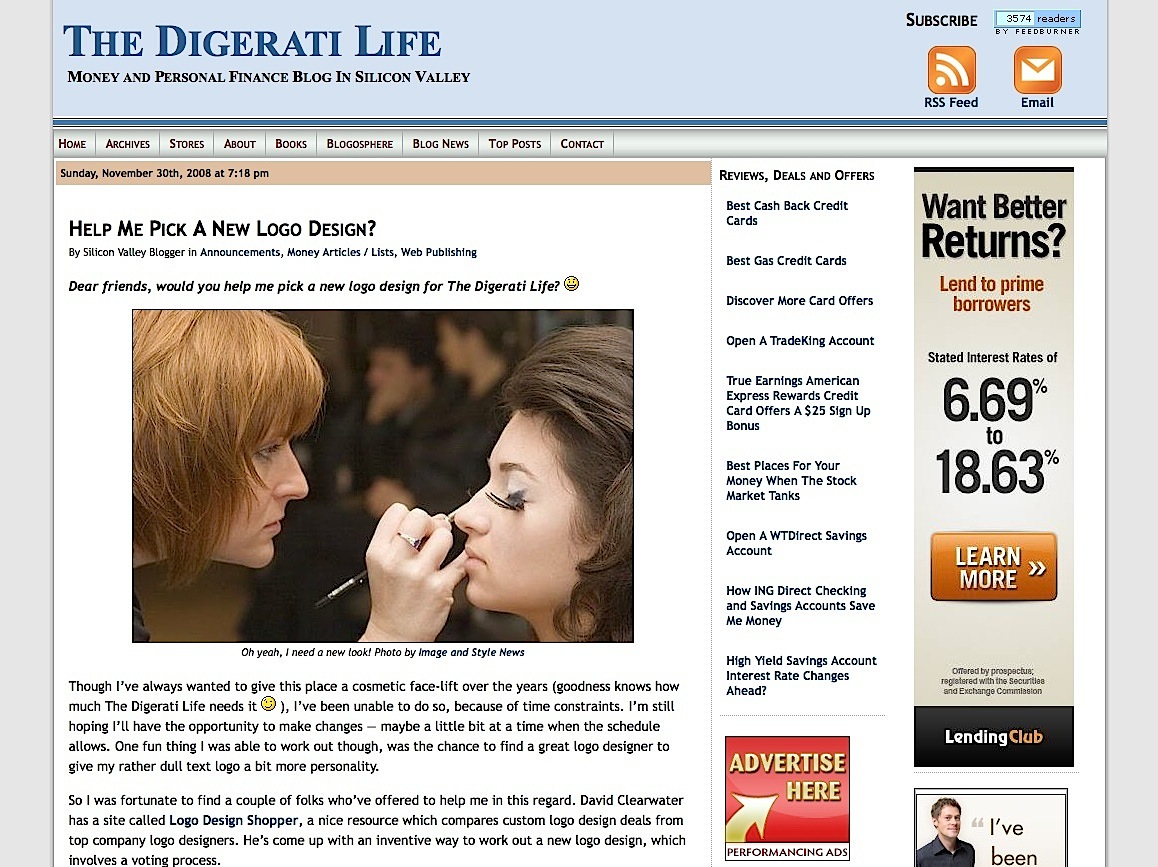
During those days, readers and bloggers always assumed I was a male blogger in my 20s, so I thought about dispelling that general impression by picking a new logo. Then when the Thesis blog theme started to become all the rage, well I buckled under the peer pressure, and I followed suit and picked up a Developer Membership. This is what I used it for, initially:
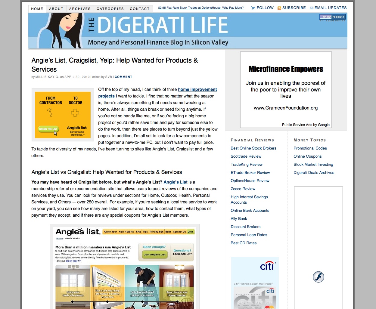
Right now, I’m still using Thesis, with just the design revamped. I like the theme not just because it’s the theme du jour, but also because it’s very customizable, as you can see by simply hopping around the PF blogosphere for a while and taking in all those unique designs. I suspect that most everyone I know is already using it. 🙂 As for this new layout — I was looking for a more flexible way to grow out The Digerati Life so I’m hoping that I’ve laid the groundwork for a more “open” foundation that will lend itself to more bells and whistles in the future. It’s going to be a busy summer!
Copyright © 2010 The Digerati Life. All Rights Reserved.
{ 26 comments… read them below or add one }
Well done on the new look, very slick and sexy. I’m going to have to do some revamps soon, these custom Thesis theme jobs are really making me envious.
Congratulations on still being in the game, too! 😉
The new theme looks great.
Thanks guys! Yes, to me, it seems that everyone and their brother is using Thesis. The concerns I hear is that it makes everyone “look the same”…. but you can always invest in some CSS work to make it more unique. I’m actually curious if there are any themes as popular as this one. A lot of bloggers I know have caved in to shell out the bucks for it…. What we like is that it gets fresh upgrades for more features (which we may or may not decide to use…. 😉 ) and it’s SEO friendly.
@Monevator,
I wondered if I would last this long doing this kind of thing. Apparently so… 🙂 Right now, it sure beats the 9 to 5!
Hey SVB
The re-design is so much slicker. I think TDL can easily be mistaken for a Yahoo or AOL mini-site now – so Congrats.
With regards to Thesis, it really is an amazing theme. For the features it offers and the opportunities to customize, it absolutely rocks. Did you do the customization yourself, SVB?
Well, I have some people close to me who helped me out. Fortunately, I’ve got a few resources here in my neck of the woods, including the Digerati Spouse and colleagues we know and worked with for a while, even in past projects. The female caricature (logo) was actually something my brother had in his portfolio (he’s an illustrator) and just gave to me on a whim some years ago.
I have to say I had to make some investments here. No freebies (although it would have been nice… 😉 ), especially with a spouse that has to take time away from his own work and projects to help out, so I have to give him my heartfelt thanks and appreciation for all he’s done.
In the past, I did my own tech work (coming from a tech background) but I soon realized that the work to maintain a site was outstripping any time I had left for doing anything else. Plus, I am not the best CSS coder around, nor do I have a background in graphics. So it was time to call in the troops! 😉
@Arjun, I noticed you’ve done a lot on your site too. Looking good!
The new look is simply awesome. I really like it a lot, and I think you and your network have done a great job! Congratulations!
SVB – Just wanted to get your thoughts on moving from blogger to wordpress and using the Thesis theme. Apart from customizabe options, does the Thesis theme also actually increase SEO and traffic to a blog? It would be a risk and take some time to convert from blogger to wordpress and wanted to see if the effort would be worth it.
Coming from the Web Design industry, and having followed your blog for a considerable amount of time already I feel compelled to commend and congratulate you on your clean new look, and to wish you all the very best for the future. It has been an interesting journey so far, and I’m looking forward to more. Thank you for all your effort to keep your readers happy!
I like the new look. Of course I did not think the old one was bad either. Good luck with all the new changes!
Love the new look and functionality. Congrats!
The new look is pretty good, though I do think I prefer the old style banner!
What I like best about the theme is that you’ve personalized it with your own avatar… it gives it a great personal touch that sets it apart from other sites. It still doesn’t give us any hints about your age, though 😛
Just one clarification, by “old style banner” I mean the one you had just before this one, not the first one you had. The one with your personal avatar is definitely much better.
@Kevin,
Ah, if you are a long time follower, you will know my age — the secret is buried somewhere in my archives. 🙂 The older avatar was nice, but I personally wanted more of the character to show vs just the close up. But we’ll see what we come up with the next time around!
SVB,
The new design is looking good.
Bret
Looking good. Also noticed a slight change in tagline that communicates what the blog provides. And I like both icon sets (the stamps and the shadowed ones in the header).
Congrats on the re-design–the site looks great!
@Jason,
Hey that’s great you noticed that. Not everyone does, actually. I did change the tagline a little too. 🙂 Thanks for the wishes!
@Everyone,
So glad you all dropped by! I so appreciate the feedback.
Thesis USED to be my choice, then Headway came and blew it out of the water.
Love the new look — nicely laid out and clean!
Very professional-looking! It manages to get a lot of stuff on the page without confusing or jarring the reader. I like the way the ads are accessible but unobtrusive.
One thing I’ve been mulling over lately: my blogger friends who are here in town remarked that they’re using the “click here to read more” links instead of running an entire post down the page, toilet-paper style. I see you’re doing the same.
As a (lazy, admittedly!) reader, personally I don’t care for that…it’s a distraction. I want to read the whole post (or decide not to) before moving on to the next one. And I don’t want to have to point and click to do it. Is there any research or credible rationale for setting up a page in this gestalt way?
I’ll try to answer a few questions here:
@Funny About Money,
The using the “click to read more” link is a matter of taste, I think. I don’t mind it, and am probably neutral to it. The thing is that I write pretty humongous articles sometimes, and if I didn’t have the “more” link, the home page would only accommodate half of the articles I can display right now. This page could get quite long otherwise.
What is your take on those sites that show even shorter excerpts? It has the same effect I would think, as those magazine style layouts which have become even more common today. In my mind, I’m doing a hybrid of the long post/excerpt, by showing one third of each article as an intro on the home page. If I have a shorter post, it appears in full…. but 800 to 1000 word articles may prove too dense for the home page (esp. if there are several of them….).
@Andy,
My opinion is that if you go with a new theme, new host and especially a new blogging domain, then be prepared for a stoppage of work because you’ll probably be working from scratch here for a while. You’ll likely lose some link juice too if you aren’t careful with the transition. Unless you have someone to help you with the process of migrating your blog and setting up a theme, it can take some work and time to do.
I moved from blogger to Wordpress after my first 3 moths on blogger when I realized my plans were going to be easier to perform by using Wordpress. I cursed and pulled out my hair for a few weeks or a month but it was worth it to me. As for theme changes, I virtually “hired” my spouse to do the work. He has more experience in the CSS/PHP front and he was insistent that he wanted his back end layout to be “pristine” and not be messed up by my newbie moves. So I left him to do it. Still, it took him time to understand the framework and all.
My recommendation is this: “YES” do the migration and do the theme change to a more highly powered theme (better plugins, upgrades, SEO support, etc), but I would not do this alone. I would look for a blog coach or expert who has done this before who would be happy to help you (e.g. do it for a fee). Like with anything else, the more complex something gets, it’s probably best to get an expert in. If you like this type of work or enjoy tinkering with your blog internals, then you may DIY. It takes some time and again, there could be initial hits to your traffic depending on what it is you do. So make sure you research your options well. Incidentally, some blog coaches in the PF space are out there to lend their consulting services for stuff like this, I think….?
Smart move with the logo, looks great. Overall nice theme. I have been looking at some frameworks to utilize. One called studio press is nice. Already bought the core framework and one child theme. Still not completely sure about doing my own customizations. Asked about it on the forum but not too many clear answers or i am not looking in the right place. I think a lot of designers would love something like that to simplify their life.
Its been a while since I have commented on your site . . . Wow, what a change in design. I must say I miss the old colors and logo (picture of the beautiful lady) is changed slightly as well. Should I start a campaign to bring back the new design?? I note that you have changed the design of your website before (at least once prior to this time). You should consider archiving your various designs so that we can compare them over the years.
@ConsumerMiser,
The picture of the lady is still in my About Page… Logo is still pretty much similar as you can see from the images I have on the post. 🙂 Hope you don’t miss the old design too much!
BTW, I take back my comment about showing us the various designs on your site–you have done that already in this article! Thanks. Still like the previous design the best. Its the most captivating in my view. I forwarded your website in the past to friends with the old design and they have been captivated by the design and often want to know who is behind the website and if there is a real picture of the person/owner on the site. As for the new design, I like it as well, but just not as much as the previous one.
in my 6 months of blogging I did change my site three times, waiting for a 4th upgrade by a pro. Good idea to save the page designs to have a look back later