We take another peek at national unemployment statistics.
While I’d like to take a break from our collective gripes about the jobless recovery, massive consumer debt problems and undeserved excesses of big business (which continue to do creative things with their bailout money and our taxpayer dollars), it’s hard to do so when we live under the constant threat of recessionary forces.
But then again, I have this soft spot for pretty visuals such as what you’ll see below. I discovered the following graphic which shows U.S. (national) unemployment rates in a colorful map from 2007 to the present. The map shows the state of joblessness in the U.S. each month during a period of economic decline, with lighter shades in the map signifying lower unemployment. The darker colors on the map indicate higher unemployment numbers.
Here is a video version of the slideshow called The Decline: The Geography of A Recession.
U.S. Unemployment Rates (2007 – 2011), Short History of Recession
To run the graphic, please visit this link.
It’s quite interesting to see how the worst hit areas are the Western and Eastern parts of the U.S. (well, along with Alaska and Hawaii). What’s going on in the central states that make them less vulnerable to job losses? And it’s quite concerning to see the large swathes of dark gray areas in the Western part of the U.S.; so it’s no surprise that we’re seeing so many homeowners fall into foreclosure and personal bankruptcy around here.
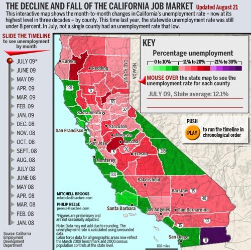
California Unemployment Rate History
What is the job situation where you are? I’ve wondered what made California’s situation less favorable, with our economy here still in the doldrums. Beyond the California budget crisis to worry about, we’ve also got the fourth highest unemployment rate with almost 12% (11.9% to be exact) of workers marked as unemployed. Some of my colleagues are still looking around for jobs or are in between projects. Where I live, the job situation just doesn’t look too comforting. I actually found another colorful map that illustrates our plight: any region that’s green (0 to 10% unemployment) is in relatively better shape than areas in pink, red and purple (21% to 30% unemployment). Check it out!
Click on this link or the image below to play with the map (the slider on the graphic below won’t work, just click the pic to try out the tool):
So how is it in your neck of the woods?
Copyright © 2009 The Digerati Life. All Rights Reserved.
{ 13 comments… read them below or add one }
My friend just got a bid away for 50% MORE money in November, 1.5 months before the bidding company’s calendar year closes. We’re talking going from $200,000 to about $300,000 in guaranteed money for 2009, and locking in a minimum of $300,000 for 2010.
The job market frenzy is returning. Who knows, if my friend waited until Feb, he may have been able to get $400,000 locked in! But the 2009 guarantee was good enough for him.
I’m going to buy a Ferrari dealership next year b/c LinkedIN is valued at $1 billion, and Facebook is valued at $10 billion and you know at least Facebook is IPOing in the next 20 months.
Best,
Sam-urai
Very interesting graphs. Let’s hope Obama makes the right decision and does not sign the Copenhagen scam. Let’s hope Congress pulls the upset and scraps health care, and let’s hope the cap and trade doesn’t pass. Each of these could have disasterous effects/impact on the economy and resulting joblessness.
Nice find. Thanks for highlighting these graphs / their source’s link. wow do they tell the story of increasing unemployment in our country.
You know you’re in a bad situation when the green color on the map is used to indicate 10% unemployment.
Well, fortunately Congress passed a trillion dollar spending spree, er, I mean stimulus package so unemployment won’t go over 8%… oops, I meant 15%. However the good news is that they holding a jobs summit to figure out what to do next. Unfortunately, they left out the NFIB and U.S. Chamber of Commerce who primarily represent small businesses, you know the groups that create 70% of the new jobs in the U.S.!
I am beginning to think that this Congress and President couldn’t find their collective backsides with both hands.
It is interesting that the midwest doesn’t have nearly the levels of unemployment of the east and west coasts.
It seems to almost follow tornado alley which is where a lot of people don’t live. I wonder if the data is accurate having a much smaller sampling size and considering most people there are rural, thus able to get help from neighbors and friends.
Just a thought, I might be way off the mark.
At the moment, i am in africa (east africa) and the situation is extremely terrible. But come to think of it, that’s the way that it has always been. a college degree has normally been the only way that one can avoid tarmacing (that’s the slang word for a job search) but now its not working anymore. the sad thing is that the complacent career students are in denial and think that it will be different in their case. this leads to a very high competition for very few jobs. and the chain reaction proceeds. this then means that quality of education lowers further as students are not studying for degrees that they have a genuine interest in but are going for the ones that are rumored to pay the best. and it still goes on. this then means that they don’t grasp the concepts being taught and in the end, a substandard degree is obtained. it is a real mess in deep dark africa.
Paul
Funny you should write about this. I was just reading an article this morning that talks about the REAL unemployment rate, which is at 16%. You can find the article here. The reason the REAL rate is higher is that the government stats do not count those that would like to have a job but have stopped looking and those that are working fewer hours than they would like.
The general environment seems to be better these days with fewer people talking about the fear of layoffs or the loss of their investments and that kind of stuff. Things may be looking up.
I knew California was having problems. It’s still amazing that unemployment seems to more than double in less than 2 years. People say unemployment is a trailing indicator of the economy. So hopefully we are pulling of the recession now and unemployment will start falling over the next 6 months.
It’s actually pretty hopping up here in San Francisco. Restaurants are PACKED, and so is the night life. Traffic is congested, and the job market is really reviving again. It’s like the bull market is back, it’s incredible!
RB
Financial Samurai
Richard M. Nixon deregulated industry after being first incumbent President to visit China. His words were ” by deregulating industry the price of products will probably go down because they will not have to comply with Gov. regs.” (close). Within 30 days GAS doubled, GOLD, our standard, tripled . So our economy(budgets) went nuts; freight rates,delivered goods. With the regs. off, the prices of goods have seen no end. Every few years, they jump, blowing any chance of budgeting out the window. We all scramble to be able to afford to drive to work. It goes on and on, with no control.
Ford’s last week in office signed “NAFTA”. Our jobs continue to go overseas and across the border. They (GOV.) white wash us with FREE TRADE & ENTREPRENEUR. Wait till the next hike!!
Stop and think about it.
The economy is picking up at a snail’s pace and the the government needs to really focus on the economy now that health care is done. That being said, Governor Schwarzenegger has done an awful job during his tenure and did nothing to help the situation!